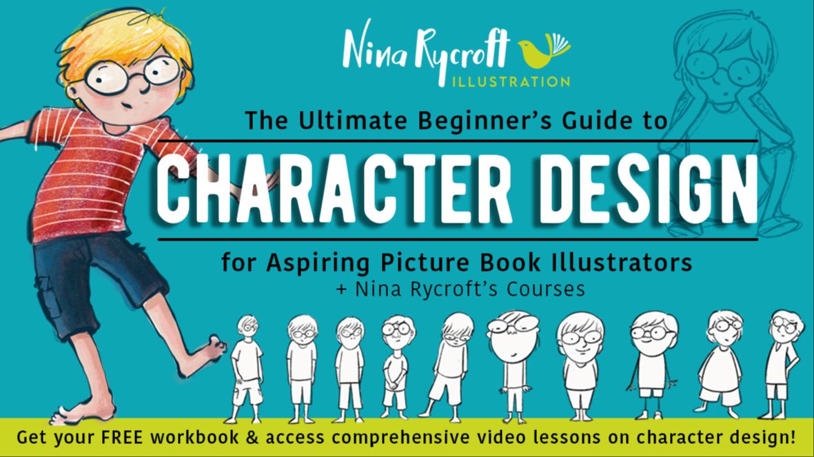
How to Illustrate a Children’s Picture Book From Start to Finish

Ever dreamt of illustrating a children's picture book?
Here, I'll walk you through all the things you need to consider BEFORE you start.
In order to illustrate a children’s picture book, you need to consider lots of factors: book size, page count, character design, the flow of text (and image), page layout, design, colour, illustration techniques, and more. With so much to think about, it's sometimes difficult to know when to start.

This is why – even having illustrated more than a dozen picture books – I still like to work alongside my Picture Book Illustration e-Course (PBIC). The step-by-step process helps me keep on track, and I really do use all the tools and resources for inspiration, character design, and developing storyboards all the way through to setting up and illustrating a final artwork.

In this blog, I’ll run you through how I used PBIC alongside illustrating my latest picture book This is The Dog (Maura Finn, Scholastic).

First Steps to Illustrating a Children’s Picture Book
Here are some steps to get you started on your picture book project. Start by doing some research. Look at lots of children’s picture books to get a feel for what type of book you’ll be illustrating – characters, settings, colour pallets, technique, and style.
The Manuscript
The word count for children’s picture books is usually somewhere between 250 and 1,000 words – in general, the younger the audience, the shorter the story. The text should already be edited before you begin. Start by familiarising yourself with the story. Read the story several times and note where natural pauses occur – this is sometimes a great indicator for where a page might be turned.
You’ll need to plan how to divide the story among the pages and how best to illustrate each double-page spread. Sometimes a publisher might send you a document with the page breaks for the story, and some may even send you the text already formatted into a document.
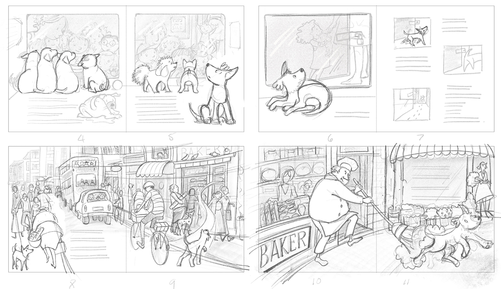
Either way, the first thing to do is to create thumbnail sketches. Below are my thumbnail sketches for This is The Dog. These are quick, rough sketches that allow me (and the publisher) to see a visual overview of the entire story. In week three of my 8-week Picture Book Illustration e-Course, I walk you through the page-break process as well as how to create thumbnails for your story.

Book Format
Before you go any further, know the format of your picture book. Will the book be a paperback, hardcover, or a board book? If you are working with a publisher, the size and format of your picture book are usually written in your contract. Below is a section of my storyboard for This Is The Dog. I usually sketch these on standard printer paper because it's an easy size to work with, scan, and send to the publisher.
You can browse your local bookstore and library to see what sizes and shapes will best suit your children’s picture book. If you are self-publishing or creating illustrations for a portfolio, stick to standard sizes. That way, the book can be printed almost anywhere in the world by offset press, digital printing, and/or print-on-demand (POD). Popular mid-sized children’s picture books are:
- Square (8″ × 8″)
- Portrait (8″ × 10″)
- Landscape (10″ × 8″ )
During the storyboarding week in the Picture Book Illustration e-Course, I offer storyboarding templates for all of these.
Page Count
The standard page count for a children’s picture book is 24 or 32. In fact, 24 is often the minimum page count for perfect binding. Multiples of 8 or 12 are the most cost-effective for offset printing, and POD printers require multiples of 4.
The Picture Book Illustration e-Course comes with a comprehensive 84-page workbook. Click on the link to get your free sample of the PBIC Workbook. That's 27 pages featuring diagrams like the one below as well as a complete chapter on character design.

Storyboarding
Now that you know the trim size, format, and page count of the picture book, it’s time to plan out the pages. An easy way to do this is to make a storyboard or mockup of all the pages using the text and rough illustrations.

A storyboard will help establish the pace, rhythm, and flow of the text and illustrations. Remember that the images don’t have to illustrate exactly what is said in the story, but rather they can embellish and fill in gaps.

Use the storyboarding phase to iron out any issues that arise, get "sign-off" from your publisher/author BEFORE moving to the final illustrations, and make sure to leave enough space for the text. During week four of PBIC, we get to work on visual storyboarding.
Page Layout
The following illustration shows the reference photos that I used to design the street scene.

Children’s books often include illustrations that fill two facing pages – this is called a "Double Page Spread" (DPS). Here are a few things to consider when using this format:
- Leave enough space in the illustrations for the text. You can see that I’ve left room above the zebra crossing for the text.
- Consider either a light background for dark text or dark background for light text. Light background with dark text is easier to read.
- Make sure nothing crucial is down the center of the illustrations (in the gutter), as that area will be bound into the spine.
- A full bleed illustration will need to ‘bleed’ off the outside edges of the spread. I like to leave 10-15mm (0.125″) bleed on the top, bottom, left, and right.
Personal Touch
In the image below (the photo top left), is of my children’s great-grandfather. I wanted to feature him as a character in the baker scene for "This Is The Dog".

In my original roughs, the publisher thought that my illustrations were looking too European, so I changed the florist into the iconic Kiwi fish and chips shop inspired by Robin White's painting.
Page Design
I like to leave the page design to the designer, however, I do like to indicate where the placement of the text is designed to go on each page. In the bus stop scene, the text will sit in the yellow area top left, and in the bus scene, I’ve left plenty of room in the road for the text. Remember that children's picture books are designed for children who are still in the process of learning how to read, so make it easy for them.

If you are self-publishing, choose an easy-to-read font (serif or sans serif) at a large-ish size (such as 16 pt). It can be tempting to use a display font, but it’s best to use a very readable font.
- Always consider the placement of the text when designing any illustration.
- Make sure the text is easy to read – black text on a light illustration area is preferable, (but white text on a dark background) can be more difficult to read.
- Keep the text a good distance away from the gutter (the centerfold of the page).
- To make it easier on our young readers, make sure that the text on the left-hand page is positioned higher than the text on the right-hand page so that the blocks of text are read top, bottom, left, and right.

In the Bus driving through the town scene below, the Dog has jumped onto the bus and is driving through town. See how the shape of the curved road leads the eye across the page… top, bottom, left, and right. On the left-hand page, I’ve left space for the text in the curve of the road, and on the right-hand page, I’ve left space under the Dog character for the word “Bark!” Also, note the crop marks and the fold marks. In week 6 during my 8-week Picture Book Illustration e-Course (PBIC), I show you how to set up Master Guides for your final artwork.

In the park scene below, see how I added a deep shadow in the foreground so that the eye was drawn toward the background. The eye follows the trail for the dog… top-left, hopping off the bus and running through the park gate… wiggling and winding his way through the park, (saying “hi!” to all the dogs along the way), jumping across the gutter, wiggling and winding until he reaches the bottom-right, where he sits and faces the text.

Even after sending through thumbnail sketches and a storyboard, there still might be last-minute changes. In the park scene above, the publisher noticed that there were no men! I managed to change the woman in the foreground and the elderly lady (in the back right behind the umbrella) into men! I can also see how I replaced the hot dog stand with a family eating lunch around a picnic table.
Characters
Characters are used to carry the plot, theme, mood, ideas, and emotions of the story. Week two of PBIC is all about character, where I show you how to design, draw, and design character maps for each of your characters.

To bring LIFE to any character, you need to be able to move your character through the pages of the story. This means, being able to draw your characters from every angle.
Another great way to bring more life to characters is to have them interact with each other and to bring story to every character sequence.

The scene above shows a three-part sequence of Dog being discovered by the girl: the discovery, touch of the girl, and sniff of Dog. To bring more emotion to the interaction, I used story, body language, and facial expression.
A Picture Speaks Louder Than Words
In some illustrations, you may choose not to have any text or very little text, In the start double-page spread, the girl could see in DO what no one else could see, this became more of an imaginary piece illustrating “clever”, “brave”, “loyal”, “silly” and “fun”.

Designing the Front Cover
The book cover should appeal to its market, in other words, to its potential buyers and readers (adults) as well as children. The front cover illustration needs to reflect the story, yet not give too much away.
These days, most people buy books online, so most potential customers will be looking at a tiny thumbnail. The front cover needs to be eye-catching even at a small size. The front cover includes the book title and the author’s and illustrator’s names. If you choose to use a display font for the title, make sure it’s easy to read from a distance and on a small thumbnail.
When illustrating a picture book, I usually leave the cover to last. A cover idea may come while I work through the internal illustrations and by this stage, I’m familiar with the characters, the look, and the visual story.

Simply Brilliant
Some people assume that illustrating a children's picture book is a quick and easy process because they contain so few words and pages. On the contrary, a children’s book can take anywhere between 3-5 months to illustrate and a lifetime to develop the skills and techniques that give this art form the quality that it truly deserves. In fact, it’s in the simplicity that you’ll discover the brilliance of a picture book story.
 A picture book is a child's introduction to literature, art, imagination, and the human experience, and if done well, a picture book can make complicated topics approachable and easy to understand. Picture books are designed to inspire wonder and curiosity, and to reflect the world that we live in, as well as adding depth to how readers see the world and their place in it.

Have you dreamt of being a Picture Book Illustrator?
Children’s picture books offer illustrators an opportunity to collaborate with authors, publishers, art directors, and their readers in a unique way. It's an art form like no other and one that I am truly passionate about.

Click on the link to find out more about the Picture Book Illustration e-Course. I've had dozens of PBIC students go on and create exciting illustration careers. And if you haven't already, make sure to get your free 27-page Picture Book Illustration Workbook.
Empowering creatives,
Nina
Follow me on Instagram, I'll meet you there.
PS – And one last thing that might interest you. If you're an illustrator or on the hunt for an awesome illustrator, you're in luck! Toptal's Hiring Guide is the ultimate hotspot for top-notch illustrators and designers. This guide is packed with all the insider tips, tricks, and techniques to help your illustration project. So, if you're ready to take your illustrations to the next level or find the perfect illustrator for your project, this guide is worth taking a look at.
Stay connected and get the latest illustration news and inspiration delivered straight to you inbox!

Nina Rycroft
Picture Book Illustrator
Since 2000, I’ve been bringing picture book stories to life with my illustrations. Now, I’m excited to share all the tips and insights I’ve gathered along the way with you. Sign up for my newsletter to be the first to hear tips, get inspired, and stay updated with the latest in picture book illustration news!
Recent Posts